"Lively currents" plus ten years
Image of the Month - February 2011
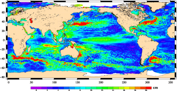
In June 2000, we published a very similar map, showing the Root Mean Square of the sea level anomalies, i.e. what varies the most in the ocean. Now, with ten more year of altimetry data to compute this map, what do we see?
Mostly, the same -- the main currents are still the most variable part of the ocean: Gulf Stream, Kuroshio, Algulhas, Antarctic Circumpolar , Loop currents... are very much there and alive. The near-ring around Zapiola ridge (East of Argentina) is also there, as well as a small feature close to Somalia. Some changes are visible, however, e.g. close to the North of Australia, in both Indian and Pacific Ocean (possibly linked to tENSO and to the Indian Ocean Dipole). Features all around are better defined. Some coastal artefacts have been removed by the improved processing, etc.
With a longer and longer continuous time series of altimetry data, we are getting a better and better picture of the ocean and its variability. With the next planned satellites (Saral, Jason-3,...), we should reach a "climatological" time span (about 30 years).
See also:
- Data: Ssalto/Duacs near-real and delayed time multimission altimeter products
- Applications: Ocean large-scale circulation

