Coloring the data
Lively Data : August 18, 2003
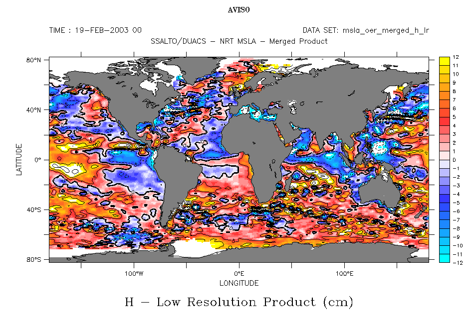
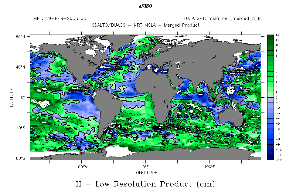
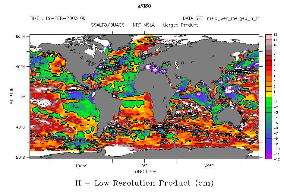
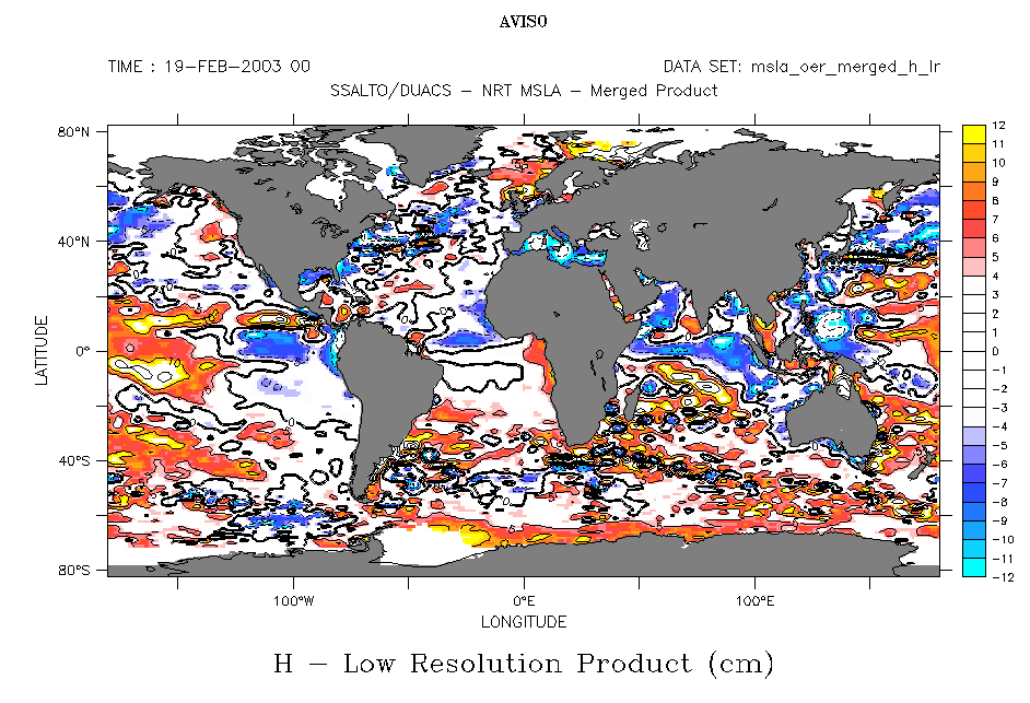
Choosing a color scale to plot data is not arbitrary. There are the minimum and maximum values, of course, but also what happens at mid-scale (around zero): do you wish to highlight the difference between positive and negative values, or is this irrelevant? The Live Access Server allows you to choose between several color scales. It's up to you to make a good choice!
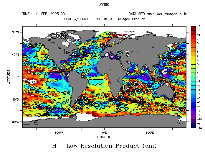 | 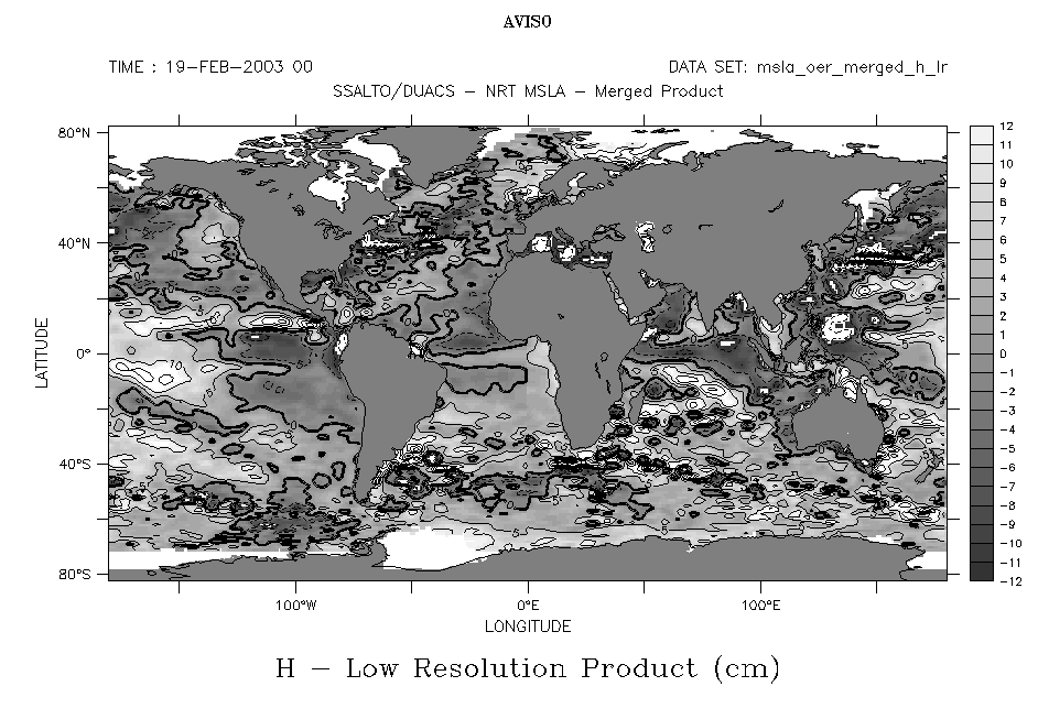 |  |
| rnb2 ("default" colorscale) | greyscale other monochromatic colorscales are available, redscale, greenscale, and ocean blue | "light centered" |
 |  |  |
| "no green centered" and also "no green" | "no red centered" and also "no red" | "rainbow" and also "rainbow by levels" |
 | 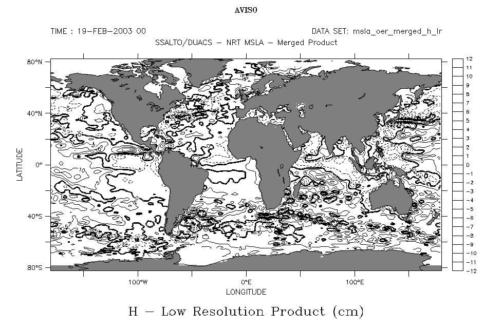 |  |
| "saz2" | "white" to see only the contours | "white centered" |
 Use the Live Access Server

