Colors or contours
Lively Data : July 15, 2004
Colored maps and well and nice, and often easy-to read. However, it can be useful to plot black and white maps. Converting a colored plot in greyscale with an image processing software oftenlead to nothing good, since color scales can vary in hue, saturation and luminosity, and that only this last parameter is used in the conversion. You can try plotting directly in black and white with a greyscale, but contours are often a good way for such plots.
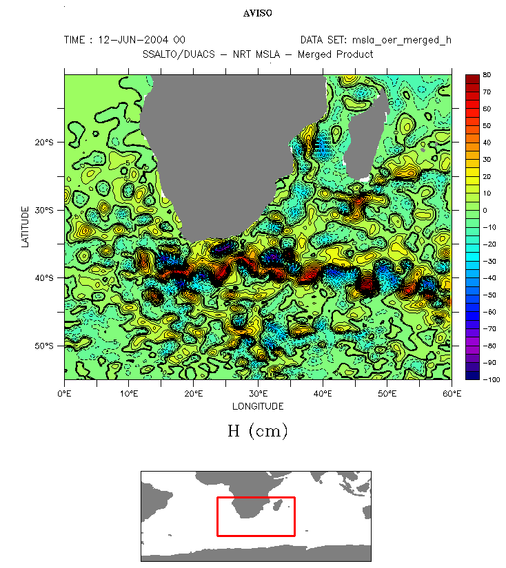


Up, near-real time merged sea level anomaly (NRT-MSLA) color map (ploted with default color scale, rnb2), and the same with only contours. To plot such a map, you have to click on "Output Options", then choose the "white" palette in the palette list. You then have a map with all colors white. Contours are solid lines above 0, dashed lines below; bold line is 0. You can constrain minimum, maximum and interval between two lines by typing (min, max, interval) in "Contour levels" (here: (-50,50,10) for left map).
 Use the Live Access Server

