How is SLA distributed
Lively Data : June 28, 2006
For non-mesoscale studies such as climate analysis, the Live Access Server provide Sea Level Anomalies (SLA) at a lower resolution (1°x1°) in Near-Real Time. This dataset can be used to plot SLA distribution all around the globe.
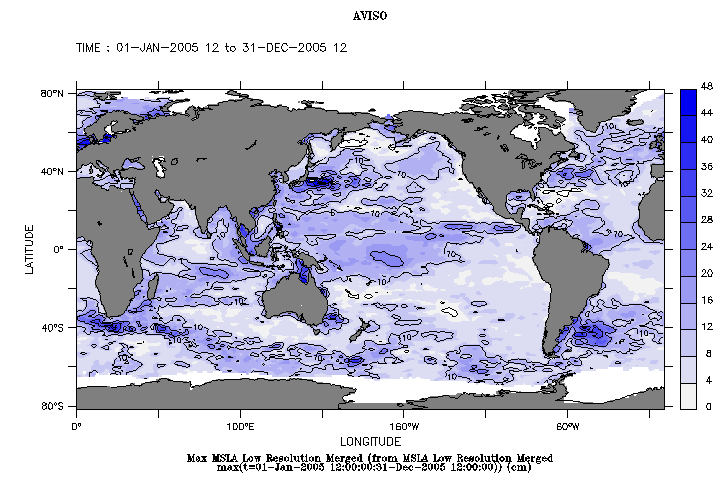
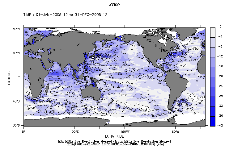
Left: Maximum Sea Level Anomaly during the year 2005. Right: Minimum Sea Level Anomaly during the year 2005.
Select Near-Real Time merged Maps of Sea Level Anomaly in low resolution, then click on "Define variable". Choose "maximum" (then "minimum") in "Select analysis type" menu, then the data period (from January 01, 2005 to December 31, 2005 here). To adjust your palette select the "Output options"; we choosed fill and contour levels as follows: (0,50,4) and (0,50,10) for Maximum maps; (-40,0,4) and (-40,0,8) for Minimum maps. Note that we selected the "inverse range of blues" palette in the first case and the "range of blues" palette in the second case, to highlight the extrema value in both situations.
In 2005 extrema values mirror the main ocean circulation structures (Antarctic Circumpolar Current, western boundary systems such as Kuroshio..), but such geographic distribution maps are especially of interest when compared with other main ocean surface parameters like salinity or temperature.
For example Levitus climatology data show that the most important temperatures on the globe are located around the Equatorial Indonesian-Pacific area, which also corresponds in our case to the maximum SLA. This area is often compared to a boiler for the Ocean/Atmosphere coupled system.
 Use the Live Access Server

