Longitude-time diagram
Lively Data : December 22, 2003
We saw previously the way to plot a Longitude-time diagram (cf A temporal slice). It was then a plot at a precise latitude, showing evolution wrt to longitude and time. We can also use the LAS functions over an area, by plotting an average in latitude.

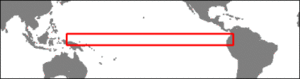
The LAS can plot an Hovmoller diagram over an area. To plot such a diagram, you have to select the variable (here Maps of Sea Level Anomalies Merged), then the area (5°N-5°S, 135°E-75°W), and afterwards click in the left menu on "Define variable". You can then choose between "average", "minimum", "maximum", "sum" and "variance", determine the title of your plot, and the axis (x, y, t) along which the statistics will be computed. Here we choose "average", and y . Then define the limits in latitude (here 5°N-5°S) on the interactive map, without touching anything on the longitude. Then click on next, to go back to the previous screen, define the time period (here the whole available period for merged data), and one more time on "next", to plot the diagram.
 Use the Live Access Server

