A temporal slice
Lively Data : November 24, 2003
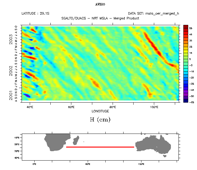
"Longitude-Time" (or "Hovmoller") diagrams are a way to see the moves of some phenomena along time. Periodic phenomena, for example, are tranlated by parallel lines. Rossby and Kelvin waves (cf Applications: Waves across the water) are thus visible. Their role in the El Niño phenomenon makes this visualization useful, since you can see the East-West propagation clearly.
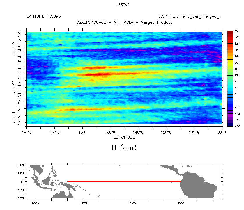

Merged sea level anomalies Hovmoller diagrams over the Tropical Pacific, from August 2001 to October 2003, at the Equator (left, automatic color scale; right, forced to -20 cm/+20 cm, see Lively data for July 7,2003). To plot such diagrams,you need, after choosing a variable, to select "xt (hovmoller) slice" in "select view" (default is "xy (lat/lon) slice"), choose a latitude and interesting longitudes (here 140°E-80°W, i.e. the whole Pacific width). Then, you can choose a period.
 Use the Live Access Server

