Along-time data
Lively Data : September 22, 2003
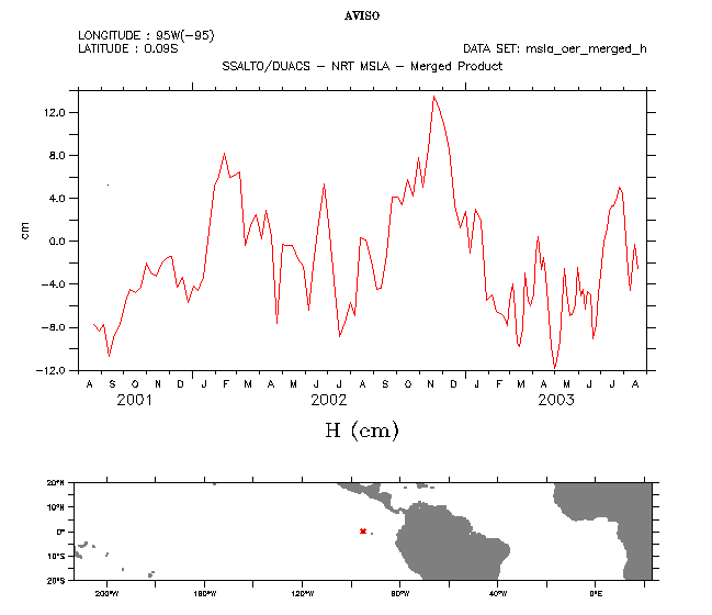
The Live Access Server can not only plot maps, but also along-time evolution by choosing "t line"in the "select view" menu. The selection on the interactive map then is reduced to one point, to be put in the area of interest (using the map, or by typing the coordinates; here --left-- 95°N, 0°, West of the Galapagos Islands), time become a "time range" to select (here, the whole series of data now available, from August 2001 to August 2003). You can thus follow the temporal evolution of sea level anomalies at a given point.
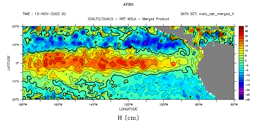
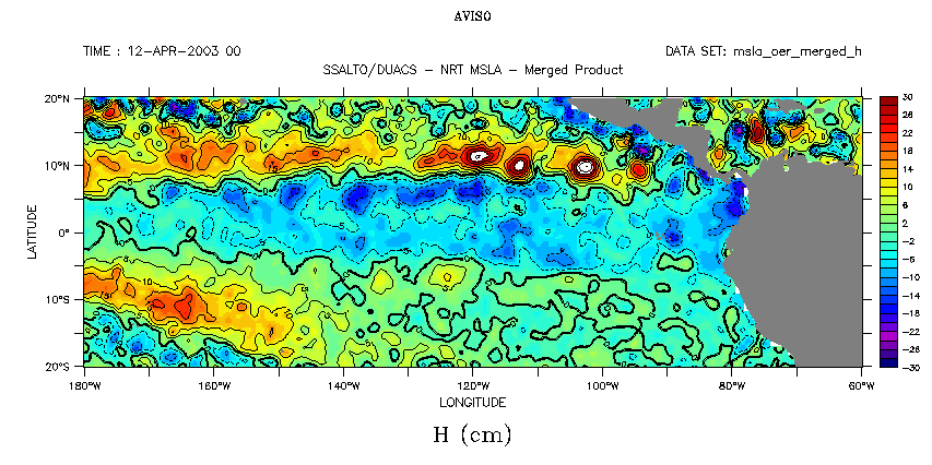
Merged sea level anomaly maps over the Tropical Pacific, when the above curve is at this maximum (November 2002, El Niño Event) and at its minimum (April-May 2003, when a La Niña Event was considered as likely). Red circle is the point where the curve is plotted.
 Use the Live Access Server

