La Niña in sight
Lively Data : February 17, 2006
Scientific community is currently monitoring the coming of El Niña in Pacific Ocean. Longitud-time diagrams are well adapted for such El Niño studies (see also Longitud-time diagram and An El Niño this year? "Lively data" pages).


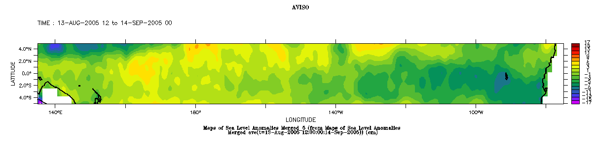
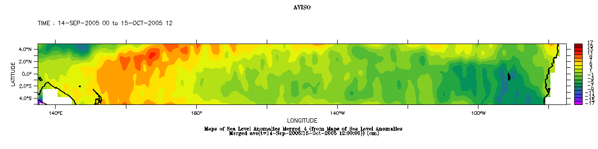
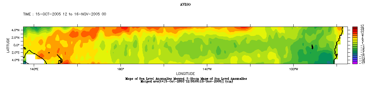
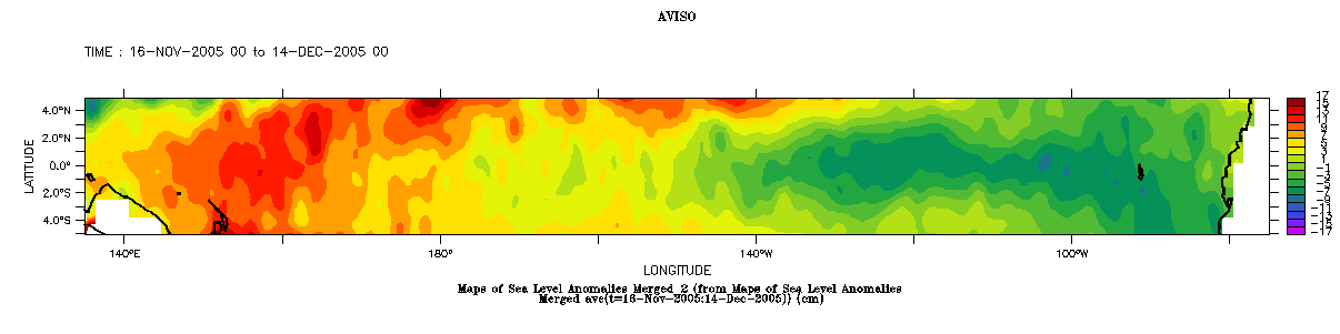
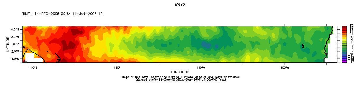
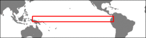
Map of merged sea level anomalies, equatorial Pacific Ocean (5°N-5°S, 135°E-75°W); each map represent the mean monthly situation. To plot such maps, you have to select the variable (here Maps of Sea Level Anomalies Merged), then the area, and afterwards click in the left menu on "Define variable". Choose "average", and t, then define the limits in latitude (here 5°N-5°S) on the interactive map, without touching anything on the longitude. Then click on next, to go back to the previous screen, define the time period ( from the mid-month to the following mid-month, approximately), and one more time on "next", to plot the map.
Here we used "output options" to force minimal and maximal values (i.e (-17,17,2) in "fill levels" field, 2 is the step); color palette is "temperature rainbow".
These maps show that an increasing anomaly in sea surface heights occures in the western boundary. Here longitude-time diagrams can be useful and were computed: the first one goes from May 2005 to January 2006, and shows the coming of higher anomaly in the last quarter of 2005. The second one include data from January 2003 to january 2006, which shows the phenomena regarding to a longer time scale.


Longitude-time diagrams, from May 2005 to January 2006 (left), from January 2003 to January 2006 (right). Diagrams were obtained using the same method as for maps, except that mean was computed on latitude (i.e choose "y" parameter in "average" instead of "t").
Progressing La Niña is visible in the top left corner.
See also :
- Applications" pages dedicated to El Niño, in particular El Niño bulletins.
 Use the Live Access Server

