Different points of view
Lively Data : November 10, 2003
The Live Access Server able you to look at an area along slightly different points of view. Low resolution gives the overview; variance shows the more turbulent areas (where the variations are strongest), etc. You can also plot averages over the whole available period (just over two years just now). This last map is more difficult to decipher, since very strong eddies can imprint their hight in it -- this is one of the reasons why we need long time series of altimetry data, to lessen this effect with more measurements. Last (but not least), if some eddies strike you as especially interesting, you can zoom on them (on a 10°x10° maximum area), to visualize the geostrophic currents that derive from their slopes.
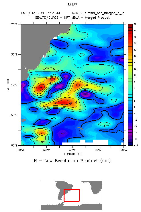
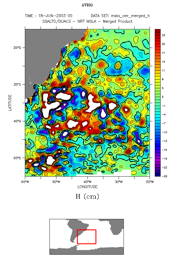
Merged sea level anomalies, low and high resolution (see "Lively data", July 15, 2003).
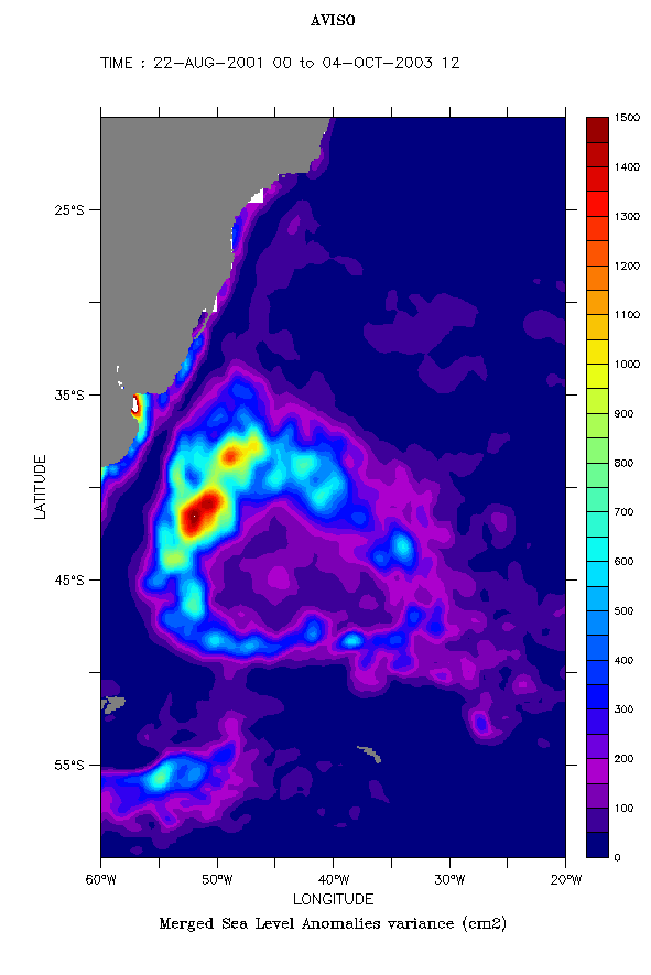
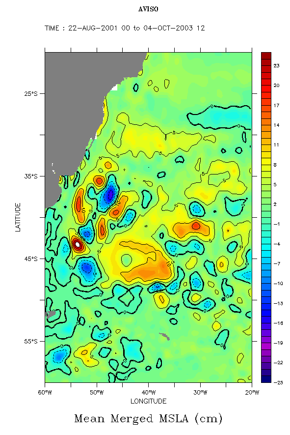
Merged sea level anomaly variance and time-mean (for the way to plot such maps, see "Lively data", October 6, 2003).
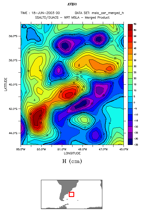
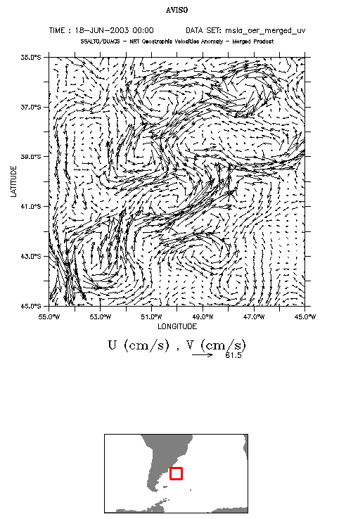
Zoom over a 10°x10° area from the high resolution merged sea level anomaly map, and associated geostrophic currents over the same area (or the way to plot this last map, see "Lively data", June 30, 2003)
 Use the Live Access Server

