Averaging an area
Lively Data : October 20, 2003
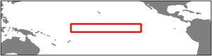
Niño studies lead to define several areas. The "3.4" area (170°W-120°W, 5°S-5°N, above) is the one where we see the arrival of the phenomenon, before it arrives on the South american coasts. Sea level evolution over this area inform better than the evolution at one point (see Along-time data, Lively data, September 22, 2003) on this phenomenon (see "El Niño bulletin" and Applications: El Niño)
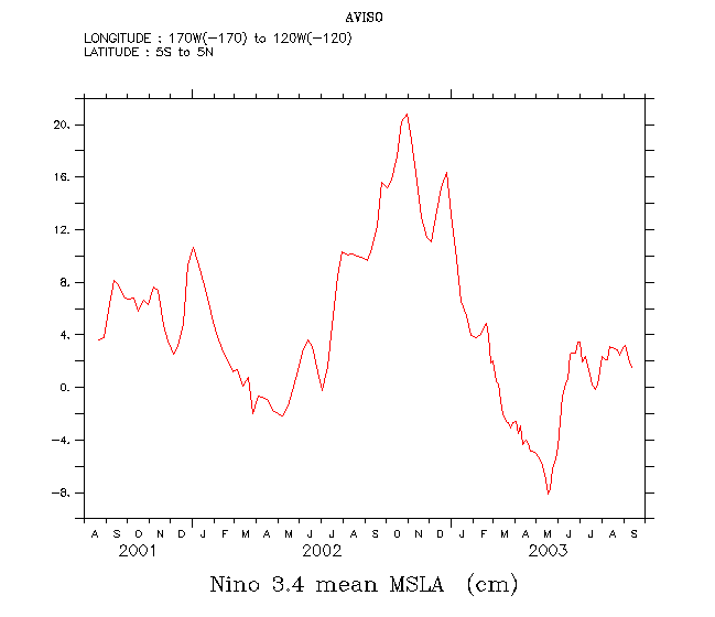
The LAS can plot the along-time variation of an average over an area. To plot such a curve, you have to select the variable (here Maps of Sea Level Anomalies Merged), then you may enter the area (5°N-5°S, 170-120°W: Niño 3.4 area), and afterwards click in the left menu on "Define variable". You can the whoose between "average", "minimum", "maximum", "sum" and "variance", determine the title of your plot, and the axis (x, y, t) along which the statistics will be computed. Here we choose "average", and x and y both. Then define the Niño 3.4 area on the interactive map. Then click on next, to go back to the previous screen, define the time period (here the whole available period for merged data), and one more time on "next", to plot the curve.
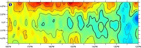
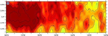
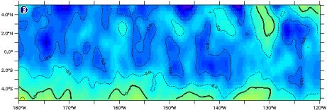
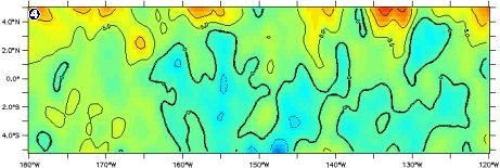
Sea level anomalies over the Niño 3.4 area, on August 22, 2001 (first data available), October 16, 2002 (highest peek, during El Niño 2002), May 14, 2002 (lowest point of the curve, when an evolution towards La Niña seemed to begin), and September 13, 2002 (last available data at the time of the plot), all drawned with the same color scale (see Scaling the ocean, Lively data, July 7, 2003).
 Use the Live Access Server

